Time Doctor’s overview dashboards provide real-time data to managers and teams at their fingertips. Our dashboards create maximum visibility into the most important insights and summaries for managers and users at the daily, weekly, or monthly levels.
We have two different dashboards: the Team Dashboard mostly used by managers and those who are delegated as admins in Time Doctor, and the User Dashboard that employees can use to monitor their own work autonomously.
With so much data and insights available on the Team Dashboard, we’ve compiled a list of the top 5 Workday Insights that the Team Dashboard can provide to managers and how to use them to impact their team’s productivity.
In a follow-up post, we’ll explore the User Dashboard and how employees can use it to get more productive.
Insight #1: See who is currently active to help with collaboration
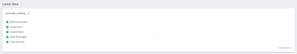
The latest data widget
The Latest Data Widget can be found when you select to view the dashboard overview under the “Today” option. This widget will show the names of employees who are currently working, in real-time. Working remotely can often cause teams to feel disconnected, so knowing who is active at the same time can create more opportunities for collaboration and team interaction.
How can you use this to impact your team?
- Managers can quickly identify team members who are online and active to help with urgent projects or deadlines that came through last minute, without having to wait for email replies.
- Team members with access to the Team Dashboard can see who is currently active to help answer questions or brainstorm ideas with. This can be especially helpful for new hires who need help during onboarding.
Insight #2: Identify high performers, faster
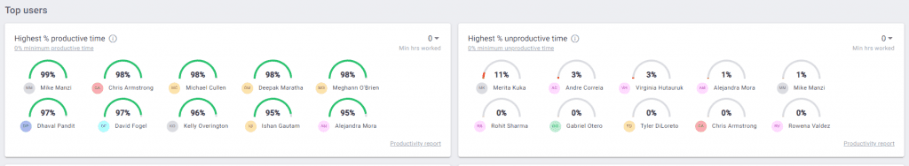
Top users widget
The Top Users widget consists of three different sections, including the employees with the highest percentage of productive time and the highest percentage of unproductive time. This helps managers easily identify the most productive and top performing employees at a glance. View this information for the day or look at the weekly and monthly views as well.
How can you use this to impact your team?
- Increase employee retention and engagement by recognizing or rewarding top performers quickly and more consistently. Showing your employees you appreciate and recognize their hard work can lead to more accountability and higher engagement.
- Understanding who the top performers are helps managers to create more accurate and attainable benchmarks for the team. Easily identify these top performers and investigate when they work and how they spend their time.

Insight #3: Identify the most productive days for teams
The trends widget
When looking at the monthly or weekly dashboard views, the Trends widget provides an overview of the total hours worked per day as well as daily productivity percentages in two, easy to read graphs. The data used for these graphs is pulled from the Hours Tracked report as well as the Web & App Usage report.
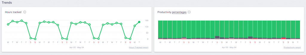
Starting with the Hours Tracked graph, managers can quickly see what days of the week the team has the most active, working hours. The Productivity Percentages graph breakdowns the productivity per day into productive, neutral, unrated, and unproductive time. This allows managers to easily identify the most productive days for teams.
How can you use this to impact your team?
- Assign urgent project and task deadlines on the most productive days to help increase the likelihood that they will get completed on time.
- Influence new hybrid work model policies by scheduling the most productive days as WFH days. Teams have already proven that they are more productive working remotely on these days, allowing managers to make more data-backed decisions.
- Compare the days with the most hours worked against the days with the highest productivity. If you find certain days with low productivity but a lot of hours worked this could indicate potential time management or focus problems.
Insight #4: Understand where teams spend their time
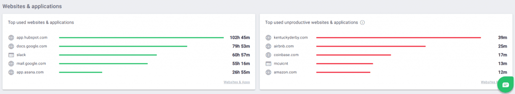
Websites & applications widget
The last widget on the Team Dashboard is the Websites & Applications widget which consists of data pulled from the Website & App Usage report.
This widget provides visibility into the top websites and applications used, broken down by what the company has determined to be productive and unproductive. Managers can use this information to quickly see where teams are spending most of their time and understand what applications they use the most.
How can you use this to impact your team?
- Understand what applications and sites are the most important to a specific team or job role with the group and user filters. For example, if you see that the highest performing sales reps spend more hours on Hubspot vs Intercom you can investigate further and see if processes need to be updated to use one application more than the other.
- Identify potential cost saving opportunities by identifying applications that are no longer being used or are not used often. Get rid of unused seats or licenses to help save significant costs. See how this company used the Web & App usage data to SAVE 6 Figures!
- Quickly assess what sites and apps distract your team members and help build policies around these. If you see a lot of time spent on social media you can decide how many hours per week or month spent on these sites is acceptable to your organization, creating clearer expectations for team members.
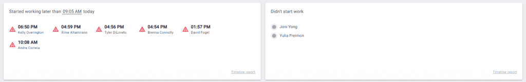
Insight #5: Monitor schedule adherence and attendance
Also under the Latest Data widget are sections that identify team members who started work late or haven’t started work at all. This information can be useful for managers to help keep track of schedule adherence as well as daily attendance. On the same note, this information can also be used to help managers keep an eye on employee engagement and well being.
How can you use this to impact your team?
- Reduce some of the admin work for managers. By having this information at their fingertips, managers can spend less time manually searching for potential issues and gain more time to focus on other areas of their roles.
- Employees who are consistently late or have frequent unexpected absences can be early indicators of low employee engagement. Managers can use this data to uncover employees who might be having personal issues or are close to burnout, giving them more time to be proactive against employee churn.
This is just the beginning of what our Dashboards can offer to your team. For more information on our dashboard insights or to see it for yourself start a free 14-day trial today!

Amy Owens is a product marketing enthusiast with a passion for writing content that communicates the features, values, and benefits of products.