Quick overview
The 9 operations dashboard metrics that improve decision-making include:
- Real-time operational activity
- Workflow bottlenecks and delays
- Workforce capacity and workload distribution
- Productivity analytics
- Time allocation across tasks and projects
- Operational efficiency trends
- Resource utilization
- Operational risk signals and unusual activity
- Performance trends across teams and workflows
This article explains how these metrics help operations leaders see workflows clearly, detect inefficiencies early, and make faster decisions. You’ll also see how workforce analytics dashboards bring these signals together.
When so much activity is already being tracked, why can your team’s performance sometimes still feel unclear?
Teams may stay busy, and projects continue to move forward. But if visibility into operational activity is limited, bottlenecks can still arise, productivity can slow, and small inefficiencies can begin to affect broader business needs.
Think of it like driving on a highway at night with a foggy windshield. The car keeps moving, but the road ahead is hard to see.
Without a clear operations dashboard, small obstacles arise too late, and minor delays quickly become bigger problems.
Table of Contents
- What are operational dashboards?
- What are the 4 types of dashboards?
- How can operations dashboards improve decision-making in my business?
- 1. Real-time operational activity
- 2. Workflow bottlenecks and delays
- 3. Workforce capacity and workload distribution
- 4. Productivity analytics
- 5. Time allocation across tasks and projects
- 6. Operational efficiency trends
- 7. Resource utilization
- 8. Operational risk signals and unusual activity
- 9. Performance trends across teams and workflows
- How workforce analytics dashboards bring these metrics together
- Why choose Time Doctor to improve operations dashboard visibility
- Final thoughts
- Frequently asked questions (FAQs)
What are operational dashboards?
Operational dashboards display real-time operational metrics and key performance indicators (KPIs) in a single visual view. This allows the team members to track performance through a centralized KPI dashboard.
This type of dashboard will help you monitor daily activity, track workflow progress, and understand how work moves across your teams, projects, and processes.
Instead of reviewing scattered reports from different tools, an operations dashboard brings operational data into one place, making it easier to identify workflow bottlenecks.
But what actually makes an operations dashboard effective?
A dashboard may display many metrics, but still fail to deliver clear insight. Because the truth is, the real value lies in how quickly the dashboard communicates what is happening.
As noted in the Impactful Engineering blog, “a visualisation should allow you to understand if things are on track in less than 5 seconds.” This principle reflects the importance of strong data visualization in effective dashboards.
It also adds that if “Don’t make me think” is a good design principle, dashboards and charts should follow the same idea. When information becomes clear at a glance, you can stay on top of performance without spending time interpreting complex reports.
The 5-second rule for dashboards
The 5-second rule for dashboards suggests that you should be able to understand the dashboard’s main message within a few seconds of viewing it. In that short moment, it should already be clear whether business operations are on track or require attention.
This means placing the most important KPIs at the top, limiting visual clutter, and ensuring that trends or risks become visible immediately.
However, not all dashboards serve the same purpose. Different types of dashboards focus on different levels of decision-making, from long-term strategy to day-to-day operations.
What are the 4 types of dashboards?
In business intelligence and data analytics, dashboards are generally grouped into four main categories based on the type of insights they provide and the decisions they support.
| Dashboard type | Primary purpose | Typical users |
| Strategic dashboards | Track long-term business performance and high-level KPIs | Executives, senior leadership |
| Operational dashboards | Monitor real-time operations and daily workflows | Operations managers, team leaders |
| Analytical dashboards | Explore data trends and investigate performance patterns | Analysts, data teams |
| Tactical dashboards | Track short-term departmental performance and team execution | Department managers |
What is a strategic dashboard?
Strategic dashboards help you monitor long-term business performance and high-level KPIs. Instead of focusing on daily activity, these dashboards provide a broader view of organizational health and progress toward strategic goals.
You will typically review these dashboards monthly or quarterly to evaluate the company’s direction and performance trends.
Common examples include:
- Revenue growth and profitability trends
- Market share performance
- Customer satisfaction and retention rates
- Company-wide productivity or efficiency indicators
Because they focus on big-picture outcomes, strategic dashboards help stakeholders and your team understand whether the organization is moving toward its long-term objectives.
What is an operational dashboard?
Operational dashboards focus on real-time operational activity and day-to-day execution. This will help you monitor workflows, detect issues early, and respond quickly when performance changes.
Unlike strategic dashboards, operational dashboards are used throughout the day to keep operations running smoothly.
Examples of operational dashboard metrics include:
- Workflow progress across tasks and projects
- Productivity patterns across teams
- Workforce capacity and workload distribution
- System uptime or service performance indicators
These dashboards are especially valuable for immediate visibility into how work is progressing.
What is an analytical dashboard?
Analytical dashboards support deeper data exploration and trend analysis. They allow analysts and data teams to examine historical data, compare performance patterns across data sets, and uncover insights that may not be visible in day-to-day monitoring.
These dashboards often include interactive filters, data segmentation, and historical comparisons.
Common analytical dashboard use cases include:
- Identifying long-term productivity trends
- Analyzing workflow efficiency across departments
- Forecasting operational demand or capacity
- Investigating performance anomalies
Because they focus on analysis rather than real-time monitoring, analytical dashboards will help you understand why certain patterns occur.
What is a tactical dashboard?
Tactical dashboards sit between strategic and operational dashboards. They help department managers track short-term progress toward team goals while still maintaining visibility into daily performance.
These dashboards are often reviewed weekly or monthly to guide departmental decisions.
Typical tactical dashboard metrics include:
- Team performance against targets
- Project completion rates
- Department workload distribution
- Short-term operational KPIs
Tactical dashboards will help you translate high-level strategy into practical team execution.

Each type of dashboard supports a different level of decision-making. Among them, operations dashboards play a unique role because they focus on real-time activity and daily execution.
This is where dashboards become especially valuable for operations leaders.
How can operations dashboards improve decision-making in my business?
Operations dashboards improve decision-making by turning operational data into clear signals that you can interpret quickly.
Key ways operations dashboards improve decision-making include:
- Real-time performance monitoring
Critical operational metrics such as workflow activity, task progress, or service queues become visible as work happens. This will allow you to respond quickly when performance slows or operational activity changes. - Proactive problem detection
Dashboards help surface workflow bottlenecks, unusual activity patterns, or operational anomalies early. These signals allow team members to address problems before delays or inefficiencies escalate. - Data-driven resource allocation
When workforce capacity and workload distribution become visible, you can balance staffing, redistribute tasks, and allocate operational resources more effectively. - Better alignment across teams
Shared dashboards ensure teams monitor the same operational metrics and key performance indicators. This helps departments stay aligned with operational priorities and business goals. - Actionable operational insights
Instead of manually reviewing reports, you can interpret performance signals directly from the dashboard. This makes it easier to make faster, data-driven decisions across workflows and operational processes.
However, the effectiveness of an operations dashboard depends largely on which metrics it highlights. Certain operational signals provide deeper insight into how work moves across teams and processes.
Workforce analytics dashboards bring these signals together by tracking the operational metrics that reveal how work actually happens across teams and workflows.
The most important operations dashboard metrics include:
1. Real-time operational activity
Real-time operational activity shows what is currently happening across teams, workflows, and projects. Instead of waiting for delayed reports, you can monitor how work progresses throughout the day and detect changes in operational performance as they occur.
This metric helps you:
- Monitor workflow activity as tasks move through processes
- Detect delays or slowdowns while work is still in progress
- Understand how operational activity changes across teams
- Respond quickly when performance signals shift
2. Workflow bottlenecks and delays
Workflow bottlenecks occur when work slows down at specific stages of a process. Monitoring bottlenecks helps you identify where tasks accumulate, approvals stall, or dependencies cause delays across workflows.
This metric helps you:
- Detect stages where work consistently slows down
- Identify process handoffs that create delays
- Improve coordination between teams and departments
- Reduce recurring operational disruptions
3. Workforce capacity and workload distribution
Workforce capacity metrics reveal how work is distributed across the team members and whether employees are operating near or beyond their available capacity. Workforce analytics dashboards will help you visualize workload distribution. This will make it easier to balance capacity and maintain sustainable performance.
This metric helps you:
- Detect workload imbalances across team members
- Identify when teams are over capacity or underutilized
- Plan staffing and scheduling more effectively
- Prevent burnout caused by sustained overload
4. Productivity analytics
Productivity analytics measure how operational time translates into meaningful output across workflows and processes. Workforce analytics platforms analyze productivity patterns across applications, tasks, and workflows. It will help you understand how work hours translate into operational results.
This metric helps you:
- Identify productivity patterns across teams
- Understand how time is spent on operational tasks
- Detect low-value activity that reduces efficiency
- Improve overall operational performance
5. Time allocation across tasks and projects
Time allocation metrics show how operational time is distributed across tasks, workflows, and projects. This will help you understand which activities consume the most time and whether resources align with business priorities.
This metric helps you:
- Understand how work hours are distributed across projects
- Identify tasks that consume excessive time
- Detect misaligned operational priorities
- Improve planning and workload forecasting
6. Operational efficiency trends
Operational efficiency trends track how performance and productivity evolve over time. Monitoring these trends will help you understand whether workflows are improving, stagnating, or declining.
This metric helps you:
- Monitor long-term improvements in workflow performance
- Detect recurring inefficiencies across processes
- Compare operational performance across time periods
- Support continuous improvement initiatives
7. Resource utilization
Resource utilization measures how effectively teams, tools, and operational capacity are being used. Balanced utilization ensures resources are neither overworked nor underutilized.
This metric helps you:
- Identify underutilized teams or resources
- Detect when teams are operating beyond sustainable capacity
- Improve workforce planning and scheduling
- Optimize how operational resources are allocated
8. Operational risk signals and unusual activity
Operational dashboards often highlight unusual activity patterns that may signal potential risks. Unexpected productivity shifts, workflow disruptions, or irregular activity patterns can indicate emerging operational problems.
This metric helps you:
- Detect abnormal patterns early through alerts and notifications
- Identify potential process disruptions
- Monitor unusual productivity fluctuations
- Respond before operational risks escalate
9. Performance trends across teams and workflows
Workforce analytics dashboards track performance trends across teams and workflows over time, allowing you to compare operational outcomes and identify which business processes consistently deliver results.
This metric helps you:
- Compare performance across teams and departments
- Identify high-performing workflows
- Detect declining performance trends
- Support data-driven operational improvements
How workforce analytics dashboards bring these metrics together
Operations dashboards become far more useful when key operational signals appear in one place. However, in many organizations, these metrics are scattered across different systems such as data management tools, productivity trackers, and reporting platforms.
When information stays fragmented, it becomes harder for you to see how work moves across teams and workflows.
This is where workforce analytics dashboards help. By integrating activity data from multiple applications, tasks, and data sources, workforce analytics platforms can generate customized dashboards that more clearly reveal operational performance.
As a result, you can better see productivity patterns, workforce capacity, and workflow performance across teams. Small inefficiencies become visible earlier. This will make it easier to respond before delays turn into larger operational problems.
Bringing operational signals together requires more than a simple dashboard. You will need a platform that captures activity data, analyzes workflow patterns, and turns operational metrics into clear insights.
So how can operations leaders gain this level of operational visibility?
A workforce analytics platform such as Time Doctor helps bring these signals together.
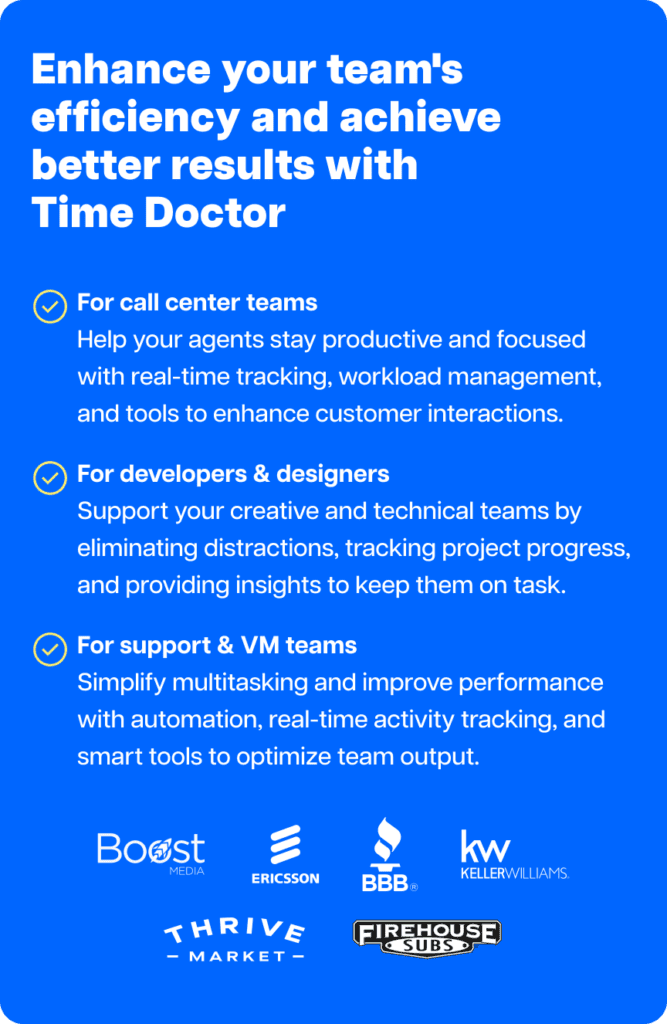
Why choose Time Doctor to improve operations dashboard visibility
Time Doctor is a workforce analytics platform that gives you the visibility to lead with trust, not control. It turns everyday work activity into AI-enhanced insights.
As a result, operational signals become easier to see. You can spot bottlenecks sooner, understand productivity patterns, and make faster, data-driven decisions.
Here are some ways Time Doctor helps improve operations dashboard visibility:
Real-time workforce analytics and productivity insights
Time Doctor brings operational data together through workforce analytics and Benchmarks AI. Activity across apps, tasks, and workflows becomes easier to understand. This will help you quickly see productivity patterns and emerging workflow issues.
While the signals from employee time tracking, productivity analytics, and screen monitoring help reveal how work actually happens throughout the day.
Clear visibility into time management and workload
Operational planning improves when time allocation becomes visible. Time tracking and productivity analytics show how work hours are distributed across tasks and projects. This will make it easier to balance workload and workforce capacity.
Early detection of operational issues
Operational signals such as unusual activity reports and productivity patterns help surface disruptions early. This visibility allows teams to address workflow problems before they affect performance.
Visibility across distributed teams
For remote, hybrid, and distributed teams, Time Doctor provides visibility through attendance data, meeting insights, and activity signals. Therefore, you can better understand collaboration patterns across locations.
Operational data connected across tools
Operational data often lives across different platforms, systems, and APIs. Integrations help connect workplace tools so that activity data appears in a more unified operational view. Time Doctor’s software cost insights also highlight how tools are being used across the organization.
Workforce management and payroll alignment
Operational visibility also supports workforce management. Attendance tracking and payroll alignment connect activity data with workforce records. This will help you maintain transparency and accurate reporting.
Turning operational signals into clearer decisions
When teams use dashboards that bring these signals together, they gain a clearer view of how work moves across teams and workflows. This makes it easier to detect inefficiencies early, improve strategic planning, and support better operational decisions.
Final thoughts
If you looked at your operations dashboard for just five seconds, would you immediately know whether things are on track?
That moment of clarity is the goal of any well-designed dashboard. When the right operational signals are clear at a glance, then you no longer need to dig through scattered reports to understand what is happening.
Sometimes, better decisions do not come from more data. They come from seeing the right signals quickly enough to act.
If you want clearer visibility into how work moves across your teams and workflows, view a demo of Time Doctor to see how workforce analytics can help support a more effective operations dashboard.
Frequently asked questions (FAQs)
Workforce analytics typically includes several categories that help organizations understand how work happens across teams and workflows. When integrated into an operations dashboard, these analytics help leaders monitor performance and make faster strategic decisions.
Common types of workforce analytics include:
• Productivity analytics, which analyzes how work time translates into output
• Workforce capacity analytics, which tracks workload distribution across team members
• Operational activity analytics, which monitors real-time workflow progress
• Collaboration analytics, which evaluates how teams work across tools and meetings
• Performance trend analytics, which identifies long-term productivity and efficiency patterns
When these insights appear in an operations dashboard, leaders gain clearer visibility into workforce performance and operational efficiency. Time Doctor helps bring these signals together by analyzing work activity across teams, applications, and workflows, making operational insights easier to understand and act on.
Creating an operations dashboard starts with identifying the operational metrics that reflect how work moves across teams and workflows. These typically include productivity analytics, workflow activity, workload distribution, and operational efficiency trends.
Next, connect data sources such as project management tools, productivity platforms, or reporting systems so that operational data appears in one place. Once the data is connected, design the dashboard so that the most important KPIs appear clearly at the top, allowing leaders to quickly understand operational performance.
The goal is to create a dashboard that makes operational signals easy to interpret and supports faster decision-making.
An effective operations dashboard should present operational data clearly through charts and graphs, helping leaders understand performance at a glance.
Key features often include:
• Real-time operational metrics and KPIs
• Clear visualization of workflows and task progress
• Productivity and workforce capacity insights
• Alerts for unusual activity or operational risks
• Data integration from multiple operational systems
These features help ensure that the dashboard highlights the operational signals that matter most for managing workflows and performance.
Operations dashboards improve business efficiency by making operational data easier to understand and act on. When leaders can see workflow activity, productivity patterns, and workload distribution in one place, they can identify inefficiencies earlier and adjust resources more effectively.
This visibility helps teams streamline workflows, reduce delays, balance workloads, and make more informed decisions when operational performance changes.
Most operations dashboards combine data from several sources. These can include project management platforms, Microsoft tools such as Excel or Power BI, productivity tracking tools, mobile device activity data, reporting systems, and other operational applications.
Connecting multiple data sources allows the dashboard to present a more complete picture of how work moves across teams and workflows.
Workforce analytics platforms such as Time Doctor help unify activity data from different tools, making operational signals easier to monitor within a single dashboard view.
Organizations typically build operations dashboards using business intelligence platforms, analytics tools, or workforce analytics software that collects data from multiple operational systems.
Many of these tools provide ready-made dashboard templates that simplify dashboard creation. Organizations also review platform features, scalability, and pricing when selecting the right dashboard solution.
Workforce analytics platforms like Time Doctor can also support operations dashboards by analyzing work activity across applications and workflows, helping leaders better understand operational performance.


Carlo Borja is the Content Marketing Manager of Time Doctor, a workforce analytics software for distributed teams. He is a remote work advocate, a father and an avid coffee drinker.