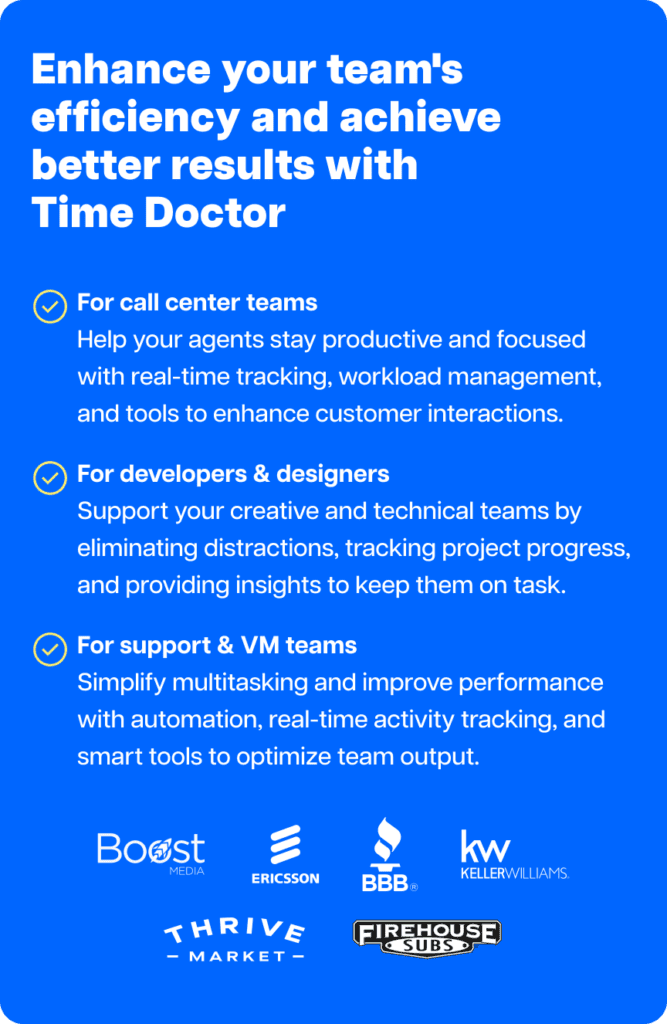
Quick overview
Most performance benchmarks are wrong.
They reward hours, activity, and output as if every role works the same way. They don’t. And that mistake is quietly hurting performance, engagement, and retention.
New data from 260,000 employees reveals why managing every role the same way is costing you your best people.
And most leaders don’t realize it’s happening.
Why does performance still feel unclear, even with so much data?
It’s like trying to manage a hospital using one patient’s vitals as the standard for everyone. The numbers look precise, but the decisions fall apart.
That’s exactly what’s happening in how leaders interpret workforce performance today.
Leaders track hours, activity, and output. Dashboards look full. Reports look clean.
Yet engagement sits at just 21%, and teams still feel stretched, misaligned, or burned out.
The problem isn’t a lack of data.
It’s relying on the wrong benchmarks and misreading workforce performance data.

The performance benchmark assumptions most leaders are running on
More hours mean more commitment.
More activity means more productivity.
More output means better performance.
It sounds logical. But it also breaks down under real data.
Behavioral data from over 260,000 employees across 12,000 companies shows something most leaders miss:
High performance is role-specific.
The behaviors that drive results look completely different across Marketing, Finance, Sales, Operations, HR, Customer Support, and IT.
What drives strong results in Sales can reduce performance in Customer Support.
What works in Operations can create friction in Marketing.
What looks efficient in Finance can introduce hidden risks.
Yet many teams still measure performance using a single definition instead of understanding team productivity by role.
That mismatch quietly leads to burnout, inefficiency, and missed opportunities.
What the data reveals about performance myths
Time Doctor’s Employee Productivity Benchmarks Report shows these numbers:
- Only 21% of employees are engaged
- $438B is lost annually due to low productivity
- 76% of leaders say AI increases their need for better data
- 66% say their data is incomplete
- 64% say it’s inaccurate
As a result, many leaders are still managing performance by gut feel instead of clear data.
The issue isn’t just visibility.
It’s visibility without context.
Most workforce performance data still relies on surveys or self-reporting, which is exactly why 66% of leaders say their data is incomplete. That leaves blind spots in how performance is measured and decisions are made.
When your data is incomplete, your benchmarks are unreliable. And when your benchmarks are wrong, every performance decision that follows becomes a guess.
Instead of relying on opinions or surveys, this analysis looks at how work actually happens day to day using Time Doctor’s Benchmarks AI.
It uses behavioral data across 12,000+ companies, including app usage, break patterns, idle time, AI tool adoption, and collaboration rhythms.
That changes the conversation.
Instead of guessing how work happens, leaders can see it clearly.
And the biggest takeaway is simple:
There is no single definition of high performance.
You’re not measuring performance incorrectly. You’re measuring the wrong thing entirely.
Most leaders are still managing their teams against assumptions that the data has already disproved.
Some of the most surprising findings challenge what most leaders assume about performance:
- In Sales, high “idle time” often reflects time spent in meetings and customer conversations, not disengagement. But without context, it can also point to delays or inefficiencies in the sales process.
- In Customer Support, top performers take significantly more breaks, not fewer
- In Finance, low AI adoption doesn’t always mean lower performance, but it can signal missed efficiency gains
What looks unproductive on the surface can actually drive better outcomes.
Here’s how the most common performance benchmark assumptions break down when you look at real data:
Check out the video below.
Myth 1: Top performers work the longest hours
Hours often get mistaken for commitment.
But the data shows something different.
Top performers in Customer Support and Sales track similar hours, around 41 hours. What drives results is how they structure those hours, not just how many they work.
In Operations, top performers average around 51 hours per week.
But even here, performance isn’t driven solely by volume.
It comes from rhythm:
- Focused work blocks
- Clear task transitions
- Consistent recovery patterns
Without that structure, longer hours lead to fatigue, not results.
The full report breaks down what high-performance work rhythms look like across roles.
They don’t match what most leaders currently reward.
Myth 2: A higher productivity percentage always means better performance
Productivity percentages look clear and objective.
Higher numbers feel like stronger performance.
But that assumption breaks down fast in real operations.
Let’s say your Finance team reports consistently high productivity scores. Work is structured, focused, and easy to classify. The numbers look strong, and performance appears high.
Now look at your Marketing team. Their productivity percentage may seem lower on paper. However, their work involves testing campaigns, exploring ideas, and switching between tools. That effort doesn’t always register as “productive” time, even when it drives real results.
Both teams perform at a high level. The difference comes from how the work happens.
Productivity percentages often reflect work patterns rather than actual performance.
When leaders rely on a single metric, they risk misreading contribution, undervaluing creative roles, and over-rewarding work that simply looks efficient on paper.
Performance becomes clearer when you look beyond percentages and understand how time, tools, and workflows connect to outcomes.
Myth 3: Breaks reduce productivity
Many teams still treat breaks as lost output.
But the data shows the opposite.
The highest-performing groups aren’t the ones taking the fewest breaks.
They’re the ones taking structured, consistent breaks.
Recovery supports:
- Sustained focus
- Lower error rates
- Better engagement signals
In Customer Support, teams with disciplined break patterns consistently outperform others.
Breaks aren’t a tradeoff.
They’re part of the system that drives performance.
Break patterns vary widely across roles, and the gap between high and low performers isn’t what most leaders expect.
Myth 4: Everyone should adopt AI at the same rate
AI adoption often gets treated as a race.
More usage equals better performance.
But the data tells a different story.
AI fit matters more than AI frequency. IT teams use AI more than Finance but less than Marketing, because different roles benefit from AI in different ways.
When AI aligns with how work gets done, it creates leverage.
When it doesn’t, it creates friction.
In Finance, for example, adoption gaps highlight both efficiency opportunities and potential risks.
More AI doesn’t automatically mean better outcomes.
AI adoption patterns vary widely by role, revealing where efficiency gains and risks actually sit.
The bottom line
Performance isn’t about pushing harder.
It’s about alignment, and role-based benchmarking makes that visible.
Top performers:
- Work in rhythms that match their role
- Use AI where it creates real value
- Build recovery into their day
- Focus on outcomes, not just activity
Without a role-specific benchmarking process, traditional performance benchmarks often lead teams to measure the wrong signals.
They reward effort instead of impact.
They optimize activity instead of results.
Leaders who shift to data-driven coaching gain something more valuable than control.
They gain clarity, they can lead with trust, and not guesswork.
How traditional benchmarks compare to role-specific benchmarking
This is where traditional performance benchmarks start to break down compared to role-specific benchmarking.
| Traditional benchmarking | Role-specific benchmarking |
| Uses one standard for all roles | Adapts benchmarks based on team productivity by role |
| Focuses on hours worked and activity levels | Focuses on how work is structured and completed |
| Treats higher activity as better performance | Evaluates whether activity actually drives outcomes |
| Ignores differences in workflows across teams | Accounts for unique workflows in Sales, Support, Finance, and more |
| Encourages longer hours as a sign of commitment | Encourages sustainable work rhythms and recovery |
| Measures AI adoption as a volume metric | Measures AI based on role fit and real impact |
| Relies on incomplete or self-reported workforce performance data | Uses behavioral workforce performance data from real work patterns |
| Leads to misaligned expectations and burnout risk | Supports better coaching, alignment, and performance decisions |
Why this matters now
Jonathan Golden, in his Harvard Business Review article, highlights, “It’s impossible to capture the complexities of your business with a single metric.”
Yet many teams still rely on a single definition of performance across roles.
That’s the risk most organizations face today.
More data. Less clarity.
Without the right context, workforce performance data can reinforce the wrong signals instead of improving decisions.
This report closes that gap.
See how your team compares
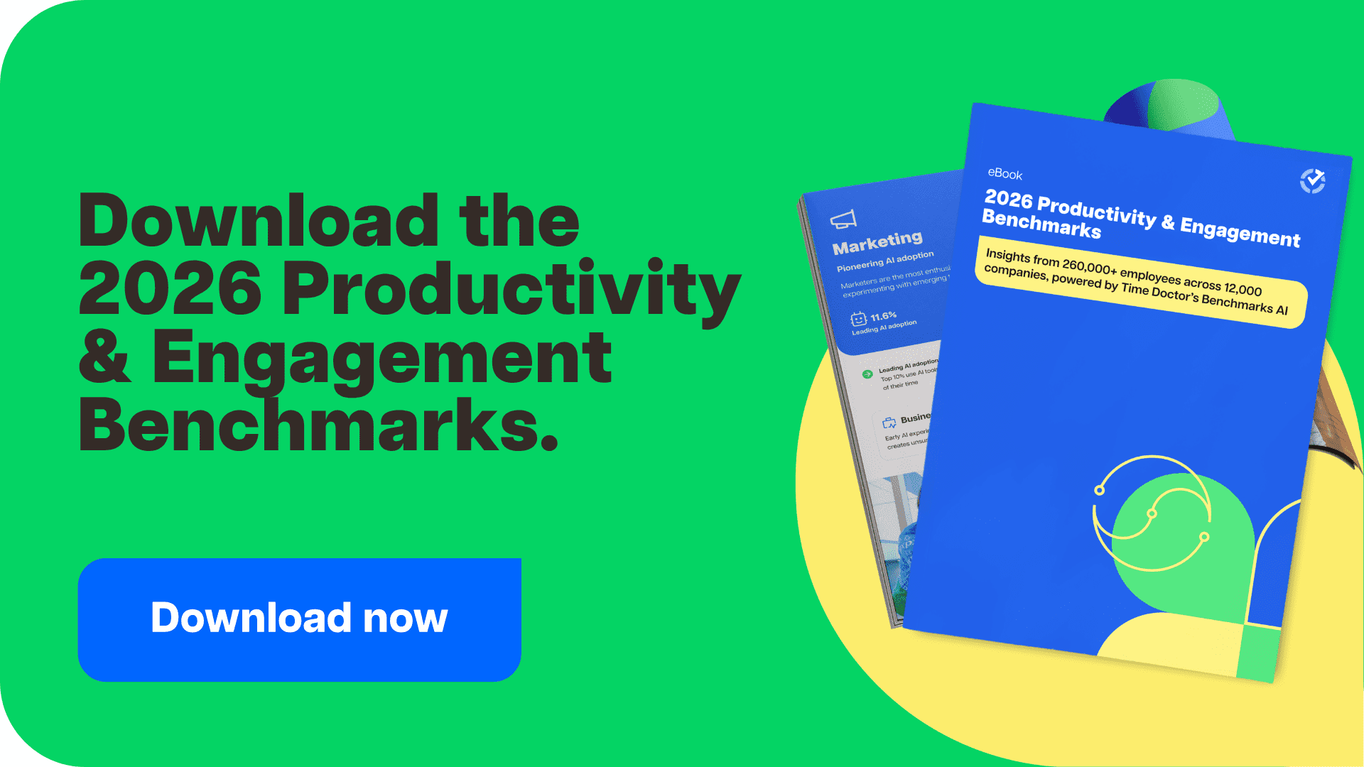
This analysis draws on behavioral data from 260,000+ employees across 12,000+ companies in 33 countries, using Time Doctor’s workforce analytics platform to turn workforce performance data into actionable insights.
If you want to understand team productivity by role across Marketing, Finance, Sales, Operations, HR, Customer Support, and IT, start with the full benchmark report.
Once you have that baseline, you can take it a step further to see how your own team compares and improve performance with role-specific insights.
Frequently asked questions
Employee productivity benchmarks are data-based standards that show how work is performed across roles, teams, or industries. They help leaders compare performance, identify gaps, and understand what “good” looks like using real workforce data.
Each role has different workflows, tools, and performance drivers. For example, Sales relies on responsiveness and follow-ups, while Operations depends on process consistency. A single benchmark cannot accurately measure both, which is why role-specific benchmarks are more reliable.
Workforce performance data includes real activity insights such as time usage, app usage, idle time, break patterns, and collaboration behavior. It helps leaders understand how work actually happens across teams instead of relying on assumptions or surveys.
Behavioral data reflects actual work patterns, not opinions or memory. Surveys depend on self-reporting, which often leads to incomplete or biased insights. Behavioral data provides a clearer and more reliable view of performance.
Leaders use benchmarks to:
• Identify high-performing patterns by role
• Spot inefficiencies and workload imbalances
• Improve coaching with data-driven insights
• Align performance expectations with real work patterns
This helps teams make better decisions without relying on guesswork.
Time Doctor is a workforce analytics platform that helps you understand how work actually happens across your team. It turns workforce performance data into actionable insights, so you can compare performance, identify patterns, and lead with trust using real data.
Traditional productivity metrics focus on output or hours worked. Workforce performance data focuses on how work actually happens, including behavior patterns, time usage, and workflow dynamics. This gives leaders a more accurate and actionable view of performance.
Team productivity by role refers to how performance varies across different functions based on how work is actually done. Each role has different workflows, tools, and expectations, so measuring productivity the same way across teams often leads to inaccurate conclusions.