&w=3840&q=75)
&w=3840&q=75)
Our identity is the face we show to the world.
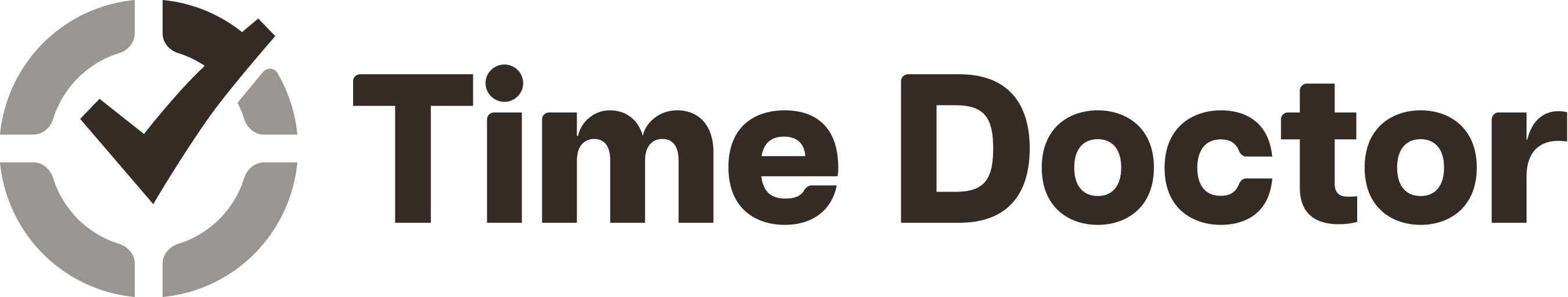
Our logo unit includes a clock with a check mark, indicating that performance is improving as time is tracked and analyzed. The typeface is clear and straightforward, indicating that we are rational decision-makers who rely on data. The colors are bright and vibrant, reflecting our optimism about the freedom and flexibility we help create.
Primary logo
The primary logo consists of two elements: An icon and the logotype. The official logo is the whole unit which includes both the icon and logotype.
The unit or the monogram cannot be altered or re-proportioned in any way, except as specified in this manual. To maintain integrity, they must be reproduced from original files.
&w=3840&q=75)
&w=3840&q=75)
&w=3840&q=75)
&w=3840&q=75)
&w=3840&q=75)
&w=3840&q=75)
&w=3840&q=75)
&w=3840&q=75)
&w=3840&q=75)
&w=3840&q=75)
&w=3840&q=75)
&w=3840&q=75)
&w=3840&q=75)
&w=3840&q=75)
&w=3840&q=75)
&w=3840&q=75)
&w=3840&q=75)
&w=3840&q=75)
&w=3840&q=75)
&w=3840&q=75)
&w=3840&q=75)
&w=3840&q=75)
&w=3840&q=75)
&w=3840&q=75)
&w=3840&q=75)
&w=3840&q=75)
&w=3840&q=75)
&w=3840&q=75)